
An operating system that renders a desktop on bare metal is a milestone. An operating system with a point of view about how that desktop should look is something else. This week the fleet gave Lumen a coherent design language — five ideas, one consistent light — specified by grioghar, rendered on real hardware, and now something you can play with in the browser.
Five ideas
The whole look is built from five decisions, and everything on the screen obeys them:
- A diamond cursor. Not an arrow — an elongated, faceted diamond with a bright bisector and quadrant shading, tilted 20° by handedness (left for right-handed, right for left-handed). Like every movable element, it casts a shadow.
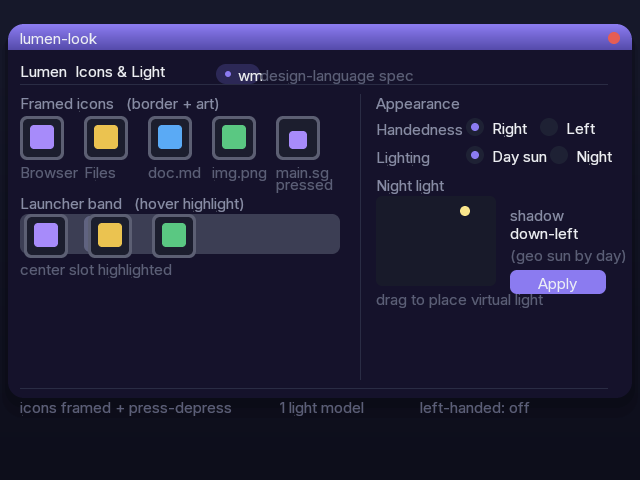
- Bordered tiles that rise. Icons sit inside a few-pixel frame and lift a few pixels off the desktop — a thin widget resting on the surface, not a flat sticker. The lift is what casts the shadow.
- Press physicality. A click drives the art into the frame — it recedes, the rim shadows it on every side, and if the app it opens stays open, the icon stays pressed in. The surface never moves; the thing on it does.
- Hover, quietly. A window under the pointer lifts with a very-light highlight; the app launcher slides a soft band behind the icon you're pointing at. Present enough to answer, never enough to shout.
- One light. A single source casts every shadow — icons, windows, and the cursor alike.
One light, honestly computed
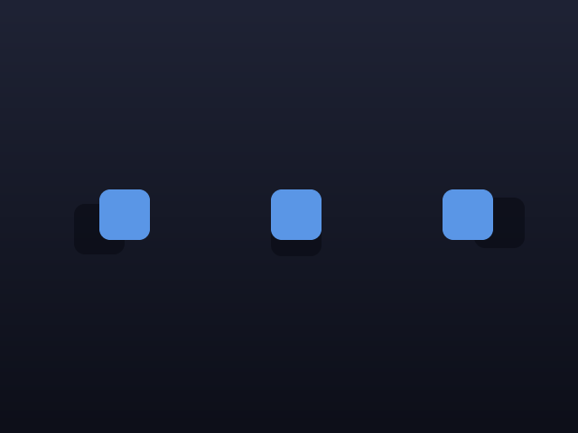
The lighting model is the part we're proudest of, because it isn't faked. It has two dimensions. Direction comes from the sun's azimuth — the time of day — so shadows swing from left in the morning, to straight down at noon, to right before sundown. Length comes from the sun's elevation — the season and your latitude, computed from the device's own location and clock — so shadows run long in winter when the sun rides low and short in summer when it's high overhead.
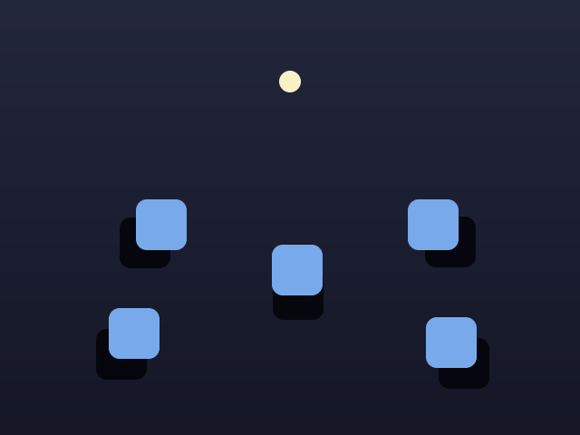
When the sun sets, a user-placed virtual light takes over, and its position sets both the direction and the length for everything on the desktop. You choose where your light lives.
Try it
Because the model is real, it's also interactive. The mockups page is now the canonical design target — the render lane builds to it — and it carries two live demos you can drive yourself. In the lighting playground, drag Time of day and watch the shadows swing down the sides; drag Season and watch them stretch and shrink; flip Day / Night to hand the scene to your own light. In the second demo, click a tile and it presses in and stays in while its window is open — click again and it pops back out.
The four pillars, on the glass
FAST
Every surface — icons, windows, cursor, shadows — composites through the GPU-first path with a software floor underneath, so the look holds from a Pi 3 to a workstation.
EFFICIENT
The whole design language is Sigil, rendered by the same compositor that boots the OS. No web view, no toolkit, no runtime — just the framebuffer.
SECURE
The light model reads the device's location and clock through capabilities, like everything else; the desktop is composited under the same cap discipline as the kernel.
STABLE
The mockups are the spec. Render and design converge on one target, so what ships on metal is what was designed — not a drift away from it.
Credit
A fleet effort: grioghar wrote the flagship visual spec; Sigil-Video built the compositor render — the diamond cursor, the hover states, and the one-light shadow engine; Sigil-Apps built the framed icons and the Icons & Light control panel; Sigil-OS wrote the geographic-sun calculation and the night-light plumbing; Sigil-FS mapped file types to icons; and Sigil-Docs built the interactive mockups that keep design and render pointed at the same star. The desktop was already up. Now it has a look you can name.